The Results Are In: 2017’s Color of the Year

Home Design, Interior Design
Sunshine Drapery sliding glass doors window treatment

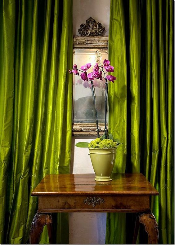
The results are in! Pantone Color Institute forecasters have announced “greenery” as the color of the year for 2017. Their description of the color is “a fresh and zesty yellow-green shade that evokes the first days of spring when nature’s greens revive, restore and renew.” There is a growing movement to protect nature and this is what the color represents. Urban planning, lifestyle and architecture are embracing this new shade as well as home decorators. This shade of green evokes emotions for people returning home to take a deep breath and relax. It symbolizes the early spring, when all signs of winter have passed with its drab hues of browns and grays, and bright green, healthy new grow emerges from the ground and the trees.

The Pantone Color Matching System

Pantone created a color space that is used in many different industries. You can find Pantone colors in print for magazines and colored paints for all types of uses, plastic items and in many types of fabric for interior decorations. The Pantone guides provide a system for choosing custom made draperies,shades and custom furniture that all blend together in a color palette. For example, if you are choosing Greenery for a primary color and you want other shades of green or yellow for accent pieces, you can view the color watches in a certain color. The swatches are made in a design so that they are attached together and they fan out so you can place colors next to each other to see how they look with each other. The Pantone Color Matching System assigns a specific number to a shade of color. Greenery is PMS 15-0303. All manufacturers of fabrics of any kind know the exact shade of green that coincides with the item number.

Revolutionizing Interior Decorating

Homeowners can now choose their interior decorating fabrics, paints, bedding and window treatments themselves with the Pantone colors. Gone are the days of hoping that the bedding in your master bedroom is the same shade as the drapery fabric that you choose for custom window treatments. By using the color number, you can choose products that will be guaranteed to match highlight or make your swag window topper pop with color in a contrasting pattern.

Getting Creative with Greenery

Greenery can be paired with a large variety of other colors for contrast in decorating. It is called a “trans-seasonal” shade by Pantone to accommodate any type of living space imaginable. Since green is nature’s neutral color it allows you many choices. Some of the Pantone color palettes that pair well with Greenery are the Transitions collection that includes dark green, two shades of blue, coral, purple and rose quartz which was the 2016 Pantone color of the year. The Ethereal Material palette includes shades of tan to brown, hues of blue and pinks. The Grand Canyon collection has many shades of browns, plum wine, tans and lead gray. The Forest Floor palette includes every color of a leaf that would see in the forests of the north east in fall. Choose colors to go with Greenery from the Rev It Up or Moody Blooms collections to add bold and bright colors for a splash of color. The Fathomless palette includes every color of the ocean or any body of water that you’ve ever seen. For a much more demure color combination, choose a contrasting light color from the Calm It Down palette. Pantone’s Greenery is one of the most versatile colors in home interior and it is evident in society in both exterior and interior house paints, vehicles, clothing and textiles, bedding and even on advertising materials such as coffee mugs and business cards. If you want the most popular and fashion forward colors in your home, choose Greenery and find contrasting colors from the above color palettes to go with it.
An Easy and Fast Professional Consultation
NO OBLIGATION

Your Journey to a Beautiful Home Starts at Sunshine Drapery

Receive a complimentary professional in-home design consultation today!