Top 3-Year Decorating Colors and Revelations to Personalities

Home Design, Interior Design
Sunshine Drapery sliding glass doors window treatment

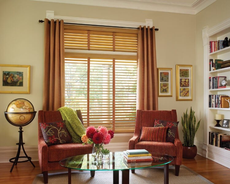
Each year typically prompts trendy, new colors that interior designers incorporate, and then consumers get inspired to weave them into our surroundings as well. Whether you’re sprucing up your home to put it on the market, or you’re just in the mood for a change, these splashes of color can be motivating for new wall colors towindow treatmentsand accessories.

For 2015, some fantastic new colors crept into home decorating. Pantone’s newest color then was Marsala, which was reminiscent of its "wine" namesake. It was used in everything from accessories to drapes and linens. It also was combined with neutral colors, such as gray, blues and greens, as well as beiges and whites. Other hot colors during 2015 included turquoise and all types of blues and greens. The color of the year for 2016 was rose quartz, which invited serenity themes to counter everyday stresses. Rose quartz was a persuasive yet gentle tone that was meant to convey compassion and a sense of composure. Also during 2016, ocean-blues were popular. However consumers also were encouraged that year to experiment with bright contrasting colors to make strong statement in their homes. Vivid patterns began to splash the fabrics of curtains and window treatments during 2016, brightening up the textile scene. Striped, geometric, floral, and abstract patterns were fair game. One of the 2015-oriented colors resurfaced when the color of the year for 2017 was presented as "Greenery." This shade of green is a light yellowish-green to symbolize the beginning of spring when everything is emerging outside. The other colors to coordinate with it are immense. Because Greenery is claimed to be nature’s neutral palette, it can be mixed with other shades of greens, blues, bright colors and any type of demure light colors as well. Another 2017 trend for window treatments is updating with, or somehow incorporating, all earth-toned colors. But don’t envision only beige! This year, many people are gravitating toward matte finishes and understated textures when decorating. Along with that indoor garnishing initiative, more and more are leaning toward earthy colors in drapes. Visualize pastels, such as blush pink, greens and lavenders — not necessarily the brown, black or gray earth tones many people think of. Three other earth tones in-between the spectrum would be sienna, ochre and umber.

What These Colors Say About Your Personality

Consider the color associations of these various practical hues:
  • Blush pink:symbolizes tenderness, peace, lightheartedness, carefree joy, playfulness, health and happiness.
  • Green:signals growth, health, environment and harmony.
  • Lavender:suggests refinement, grace, elegance, delicate, precious, purity, devotion and something special.
  • Sienna (reddish-brown or brownish-yellow):proposes open, natural, Italian and earthiness.
  • Ochre (pale yellow to an orange or reddish yellow):evokes beginnings, clay, rebirth, French and intensity.
  • Umber (brownish):implies dusk, shade, shadows, grounded and warmth.
For those interested in what color psychology means in home decor selections, different hues evoke different feelings in your home. Colors affect moods and levels of alertness in each room. There are hundreds of variations available in custom drapery fabrics, from very light to very dark colors. As you think about which trendy colors, or any color to select for window treatments in the future, following are some color associations that may help. Blue:is a very calming and serene color that promotes relaxation. It has coolness and clarity, as well as it shows intelligence. Darker shades of blue may be more of a sad color, whereas the lighter and brighter shades are very calming. Blue draperies are a great choice for a person who is very busy at work and stressful, so when they arrive home, they can have a soothing environment that is peaceful. Using blue colors in your kitchen can calm a host or chef who is stressing out over a meal. Green:is associated withnature, new growth, balance in your life, peace, and harmony. Green hues in window treatments evoke calm and quiet, but it is also an energizing color. This color is great for your personality if you are struggling to find balance in your life. Orange:is a very energetic and happy color tone. It can stimulate you both physically and emotionally in your life. People that are optimistic and happy enjoy the bright and joyful tones of orange to reflect their outgoing personality and love of life. Orange isoften used as a kitchen colorwhere you socialize with friends and family over meals and have a lot of energy. Pink:is a feminine color that is linked to great happiness, friendships and a child-like quality in your life. It may remind you of the times in your past when you had few decisions to make and life was all about having fun each day. Pink can feed your inner child and help you to achieve a bright and fun atmosphere in your home. Purple:is a color that is linked to a person with great creativity. It also is a color that symbolizes luxury and royalty, and was used by kings for their robes and regal chairs while they reigned over their people. Any person who is creative in any manner, such as a craftsman, designer, painter or crafter, can allow their creative juices to flow in a room with purple window treatments. Red:is a stimulating color that symbolizes energy, warmth, passionate and an emotional intensity. Red is a good color, if you are outgoing and intense, to increase your level of alertness in a particular room. Red tones are often used in kitchen window treatments to symbolize the color of spices. Yellow: Shades of yellow evokehappiness and warmth as sunshine does. It is a very optimistic color associated with opportunities in your future. Yellow shades promote confidence and increase your creativity level. Yellow is a stimulating color for living areas and kitchens in any shade. If you choose to have yellow draperies in your bedroom, you should probably choose a light yellow hue to make it a restful room instead of producing over stimulation and disrupting your sleep.
An Easy and Fast Professional Consultation
NO OBLIGATION

Your Journey to a Beautiful Home Starts at Sunshine Drapery

Receive a complimentary professional in-home design consultation today!